Popular:
Clipping Path
Background Removal
Retouching
Ghost Mannequin
ESC
Home
Services
Clipping Path
Background Removal
Image Masking
Ghost Mannequin
Photo Retouching
Beauty Retouching
Shadow Creations
Color Changes
Multi Clipping Path
Pricing
About Us
Contact
info@photofixal.com
+880 1714 420630
Home
Services
Our Services
Professional image editing solutions
View All
All Services
Essential
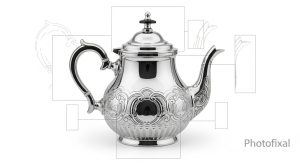
Clipping Path
clipping path service
Essential
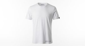
Background Removal
background removal service
Essential
Image Masking
image masking service
Popular
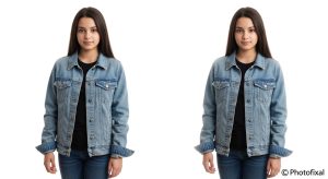
Ghost Mannequin
ghost mannequin service
Popular
Photo Retouching
photo retouching service
Premium
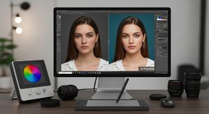
Beauty Retouching
beauty retouching service
New
Shadow Creations
shadow creations service
Essential
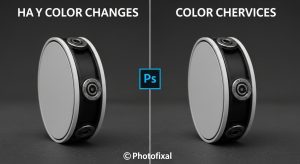
Color Changes
color changes service
Advanced
Multi Clipping Path
multi clipping path service
Pricing
Blog
About Us
Contact
Available 24/7
Get Quote